Feb 25, 2026
Understanding the Callan Chart with Diversified Portfolio: How to Read It and Use It

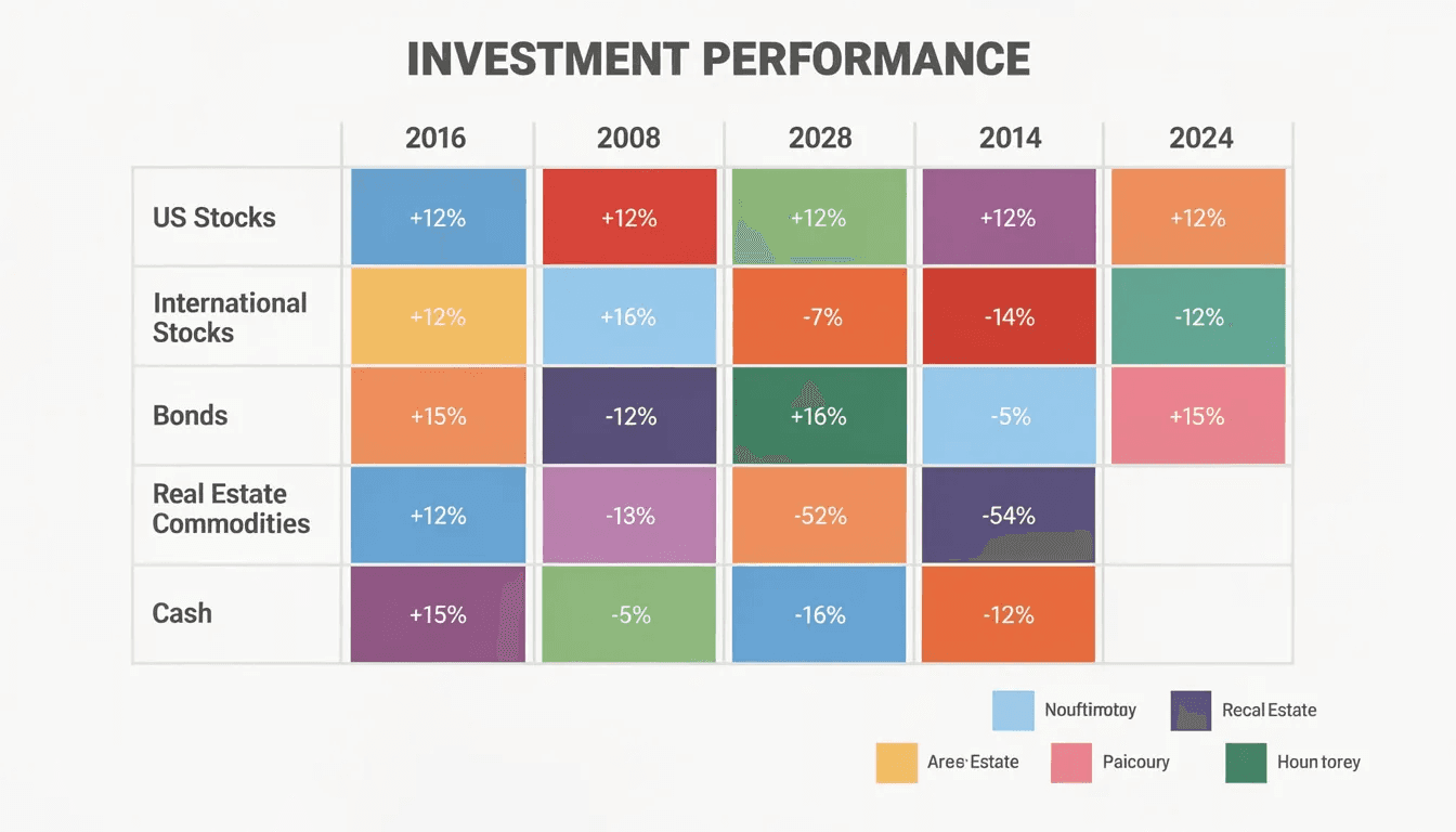
The Callan Periodic Table of Investment Returns is one of the most popular visual tools in investment analysis. Created in 1999 by Jay Kloepfer at Callan Institute, this colorful grid ranks major asset classes from best to worst performer each calendar year, making it immediately clear that market leadership rotates unpredictably.
If you’ve ever wondered how to use this table to build and maintain a diversified portfolio, you’re in the right place. This article connects the Callan chart’s annual rankings to real portfolio decisions—asset allocation, rebalancing, and risk control—using data through recent years like 2024-2025.
What the Callan Periodic Table of Investment Returns Shows
The Callan Periodic Table of Investment Returns displays annual returns for major asset classes, ranked from best to worst each year. It typically tracks market indices like the S&P 500 for U.S. large-cap stocks, the Russell 2000 for small-cap stocks, MSCI EAFE for developed international equities, and the Bloomberg U.S. Aggregate Bond index for core bonds.
Callan first released this table in 1999, and updated versions now show 20-25 years of history. Each colored tile represents one calendar year’s return for a specific asset class or index, sorted top to bottom by performance.
Here’s what you’ll literally see when you look at the chart:
Years across the top spanning two or more decades
Colored tiles for each asset class (e.g., blue for large-cap, green for emerging markets)
Percentage returns printed inside each square
Vertical ranking from highest performer at top to worst at bottom
Expanded versions may include REITs, commodities, and hedge fund strategies
Key Lessons from the Callan Chart for Diversification
The most striking pattern in the Callan chart is that no single asset class consistently ranks at the top. U.S. large-cap stocks might lead one year only to lag the next, while emerging markets exhibit extreme volatility—ranking first or last with little in between.
Consider these concrete episodes from history:
Tech bust (2000-2002): U.S. large-cap growth crashed while bonds and value stocks held up
Global financial crisis (2008): Nearly all equity classes plunged, but Treasuries provided shelter
Long U.S. equity bull market (2009-2021): Domestic stocks repeatedly appeared near the top
Inflation spike (2022-2023): Traditional bonds suffered alongside stocks, breaking typical correlations
The “random” appearance of colors jumping around year to year demonstrates visually why timing markets successfully is so difficult. Research from Callan confirms that combining multiple uncorrelated or low-correlated asset classes can reduce volatility compared to owning just one asset type.
Key patterns visible on the historical chart include:
Leadership rotation between U.S. and non-U.S. stocks
Alternating strength of growth versus value styles
Bonds occasionally leading during down equity years
Emerging markets swinging from top to bottom positions
REITs and commodities providing occasional diversification benefit
How to Read the Callan Chart for a Diversified Portfolio
Reading the Callan chart effectively requires a methodical approach. Don’t just glance at the colors—trace individual asset classes across time to understand their behavior.
Here’s a step-by-step process:
Pick one asset class color (e.g., U.S. large-cap equity) and trace its position from top to bottom across all years represented
Compare long-term leaders vs. short-term winners by looking at average position, not just single standout years
Spot downside protection candidates by noting which asset classes ranked relatively high during crisis years like 2000-2002 and 2008
Estimate diversification benefits visually by imagining a blended portfolio that would hover in the middle rather than hugging the top or bottom
Practical reading exercises for financial professionals include:
Show clients how their favorite asset class performed during the worst years on the chart
Highlight years when bonds were among the top performers despite lower absolute returns
Point out how a diversified mix would have captured some upside while avoiding the worst downside
Use the table to illustrate why chasing last year’s winners rarely works over time

Building a Diversified Portfolio Using Callan Chart Insights
The Callan chart doesn’t tell you exactly what to buy, but it reinforces why broad exposure matters. Here’s a hypothetical diversified portfolio mapped to the chart’s asset classes:
Equity allocation (60%):
U.S. large-cap (S&P 500 index)
U.S. small-cap (Russell 2000)
Developed international (MSCI EAFE)
Emerging markets
Fixed income and real assets (40%):
Core bonds (Bloomberg Aggregate)
Treasury Inflation-Protected Securities (TIPS)
REITs
Commodities
Each component maps to a color on the Callan chart. U.S. large-cap provides growth potential, bonds offer stability in downturns, and REITs plus commodities help protect against inflation.
When it comes to strategic versus tactical allocation, the chart should not be used to chase last year’s winners. Instead, it reaffirms the need for broad exposure across the grid.
Sample portfolio behavior across key years:
Year | Market Environment | Diversified Portfolio Impact |
|---|---|---|
2008 | Global crisis | Lost less than all-stock portfolios |
2013 | Strong U.S. rally | Captured substantial gains |
2020 | COVID shock/recovery | Participated in rebound |
2022 | Inflation/rate hikes | Cushioned by commodities, TIPS |
Risk Management, Rebalancing, and the Callan Chart
The Callan chart supports a disciplined rebalancing process by showing how asset classes cycle through periods of outperformance and underperformance. As some tiles repeatedly appear near the top, those asset classes grow beyond target weights and warrant trimming.
Consider this example: After U.S. equities dominated from 2017-2021, investors following the chart’s lessons would have trimmed domestic stocks and added to lagging bonds or international stocks that appeared lower on the table.
The visual of tiles moving up and down year after year illustrates volatility and sequence risk, reinforcing why diversified portfolios matter—especially for retirees who can’t afford a concentrated bet going wrong.
Institutions and advisors can use the chart in investment committee meetings to communicate why they maintain fixed policy ranges rather than making dramatic shifts after each year’s results.
Practical risk management behaviors include:
Set a rebalancing schedule (quarterly or annual) rather than reacting to headlines
Use bands (e.g., ±5%) around target allocations to trigger rebalancing
Stress-test portfolio assumptions against historical periods visible on the chart
Avoid reacting to single-year rankings, which the chart proves are unreliable predictors
Callan Chart, Target Date Funds, and Lifecycle Investing
Target date funds use diversified portfolios that automatically adjust asset mixes as investors approach retirement. This glide path concept connects directly to the Callan chart’s lessons about risk and time.
Younger investors can tolerate more exposure to the high-volatility tiles (equities) because they have time to recover from down years. Older investors lean into more stable tiles (bonds, cash, high-quality income) to protect accumulated wealth.
A typical target date fund’s diversified core might include:
U.S. and non-U.S. stocks across market caps
Core and inflation-linked bonds
REITs for real asset exposure
All of these appear across the Callan grid in different years, sometimes leading and sometimes lagging.
Target date funds don’t avoid losses—they aim to smooth the path of returns compared with a single-asset portfolio, which the colorful pattern of the Callan chart helps illustrate.
When explaining target date funds to 401(k) or IRA participants:
Show how the chart’s volatility diminishes when you blend asset classes
Point out that younger participants can handle more “red” years
Illustrate how the glide path gradually shifts toward stable-performing tiles
Use the periodic table of investment history to set realistic expectations
Historical Case Studies from the Callan Chart
The Callan chart’s value becomes clearest when you examine specific periods.
2000-2002 Bear Market: Technology-heavy U.S. large-cap growth crashed, appearing near the bottom for three consecutive years. Bonds and value stocks ranked near the top, demonstrating why style diversification matters.
2003-2007 Expansion: Emerging markets and REITs frequently appeared at or near the top of the chart. A diversified portfolio captured some of this upside while maintaining stability through bonds.
2008 Crisis: Equities across all categories plunged to the bottom of the chart. Treasuries and core bonds provided a cushion—the only bright colors near the top. A diversified portfolio lost money but far less than an all-stock approach.
2009-2019 Bull Market: U.S. large-cap stocks dominated, often ranking first or second. International equities lagged, tempting investors to abandon diversification. Yet research shows the risk reduction from broad exposure still delivered superior returns per unit of risk.
2020 COVID Shock: The sharp March selloff and rapid recovery showed the worst and best tiles appearing within the same calendar year, reinforcing why staying invested matters more than timing.
2022 Inflation Shock: Both stocks and bonds fell simultaneously, a rare diversification “failure.” Yet commodities and TIPS ranked higher, showing why even broader diversification across real assets provides value.
Using the Callan Chart with Clients and Stakeholders
The Callan chart works as a powerful storytelling tool for advisors, CIOs, and financial educators discussing long-term investing with clients.
Best practices for presenting the chart:
Start with the big picture: Zoom out and let clients absorb the randomness of colors
Zoom in on 2-3 key years: Show crisis periods like 2008 to illustrate risk, then recovery years to show patience pays off
Highlight the role of bonds: Point to years when boring fixed income ranked near the top
Client conversation ideas:
Contrast “if you held only the top asset class each year” (impossible without hindsight) versus “if you held a diversified mix through all years” (achievable and effective)
Use the chart to explain why you’re maintaining international exposure despite recent U.S. dominance
Show how rebalancing would have worked visually across multiple cycles
Specific uses of the chart in communication and education:
Annual portfolio reviews with individual clients
Investment policy statement discussions with committees
Retirement education workshops for plan participants
New client onboarding to set expectations about performance
Quarterly commentaries to provide historical context

Limitations of the Callan Chart and Responsible Use
The Callan chart is a valuable tool, but it comes with important caveats that should be mentioned whenever it’s presented.
Key limitations to keep in mind:
Backward-looking: The chart shows historical returns over specific periods and cannot predict future rankings or outcomes
Index-based: It relies on standard asset class definitions and index data, which may not fully reflect an individual’s actual holdings or fees
Ignores intra-year volatility: A calm annual return might hide a stomach-churning mid-year drawdown
No taxes or trading costs: Real-world implementation involves frictions not captured in index returns
Doesn’t capture behavior: Panic selling or market timing by individual investors isn’t represented
Treat the chart as a visualization aid for diversification principles, not a timing tool or a guarantee of risk reduction.
The Morningstar equivalent periodic table exists as well, sometimes showing slightly different asset class categories. Either version teaches the same core lesson about unpredictable leadership rotation.
Conclusion: Turning the Callan Chart into Action
The Callan Periodic Table of Investment Returns visually confirms what decades of research have shown: diversified portfolios help manage risk amid unpredictable annual rankings. No single asset class wins consistently, and chasing last year’s top performer typically backfires.
Use the chart to stay focused on sound principles:
Maintain thoughtful asset allocation across multiple categories
Embrace diversification as your best protection against the unknown
Follow disciplined rebalancing rather than reacting to recent results
Review recent versions of the chart—through at least 2025—with an advisor and map your own portfolio exposure to the different asset classes represented. If gaps exist, consider whether broader diversification might improve your risk-adjusted returns over time.
The colorful chaos of the Callan chart isn’t a problem to solve. It’s a reminder that humility and patience beat prediction every time.